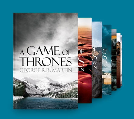
Getting fans of the hit TV show into George R.R. Martin’s epic book series: A Song of Ice and Fire.

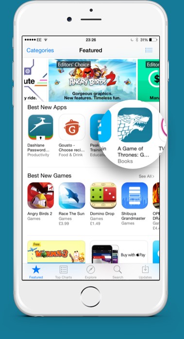
In April 2015, HarperCollins approached Reason to redesign their app for George R.R. Martin’s book series, A Song of Ice and Fire. The aim was to get fans of the HBO’s hugely popular Game of Thrones into the books and for HarperCollins to establish a relationship with customers.

My Role

Ideation

I worked closely with the product manager at HarperCollins, and head of design at Reason, to define what the product would be and what features would address customer motivations and behaviours.

Validate

I designed prototypes to validate ideas and assumptions through usability testing, and to drive decision making during stakeholder meetings.

Design Execution

I created user journeys, wireframes, prototypes, design specs and all assets needed for development.

my role

The Problem

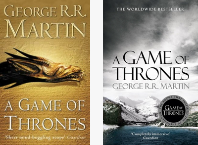
With 20 million viewers tuning into watch Game of Thrones, and the end of season 5 on the horizon, there was a huge opportunity to get viewers into the books. Initial research had proven the biggest barrier to entry was the daunting length of each book, with A Game of Thones, the first of seven books, clocking in at 298,000 words.

By leveraging short, exclusive book extracts and explaining the differences in how moments played out on the TV show, we could create a bridge into the more detailed world of the books. This would give an incentive to sign in, connecting HarperCollins to their readers.

the problem

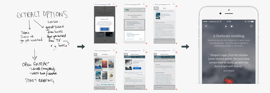
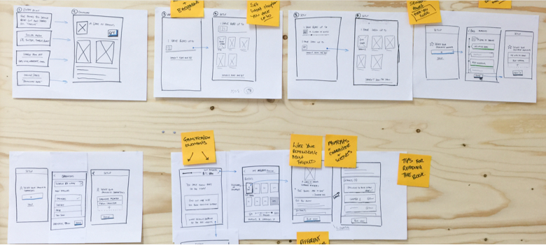
From Kick-off to Prototype in 6 Days

With a launch date for the app set to coincide with the end of Season 5, timelines were tight and the design process required a lean approach.

After a couple of super productive workshops with the product manager at HarperCollins, and head of design at Reason, we identified what success meant to stakeholders and the users. This lead us to some high level user journeys and provided the basis for the first prototype.

Taking the journeys from the whiteboard, I sketched out each page on paper, created a set of low fidelity wireframes in Keynote, and exported these to create a clickthrough prototype in Flinto. The prototype made it easy to drive decision making when presenting to stakeholders, many of which were new to digital product development.
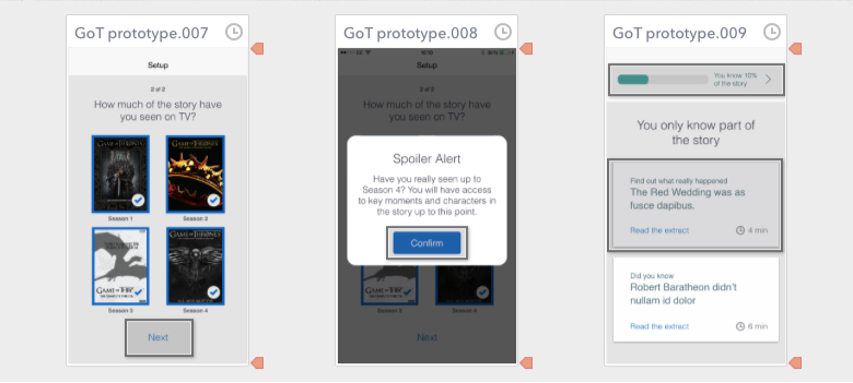
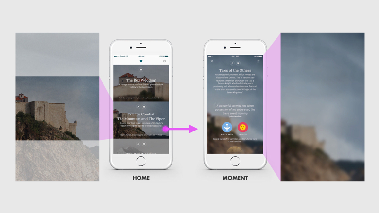
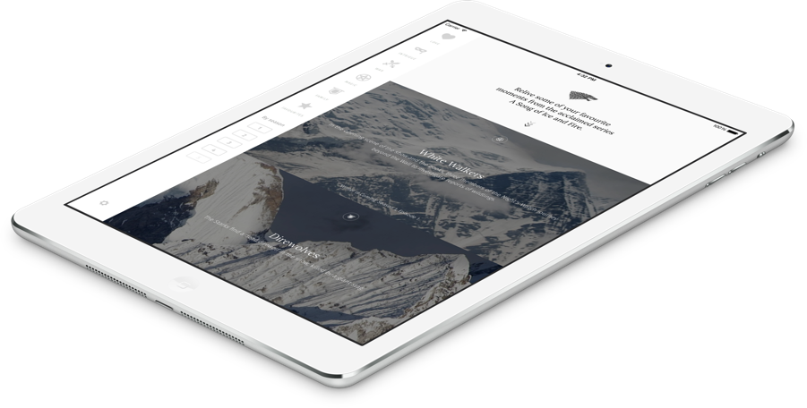
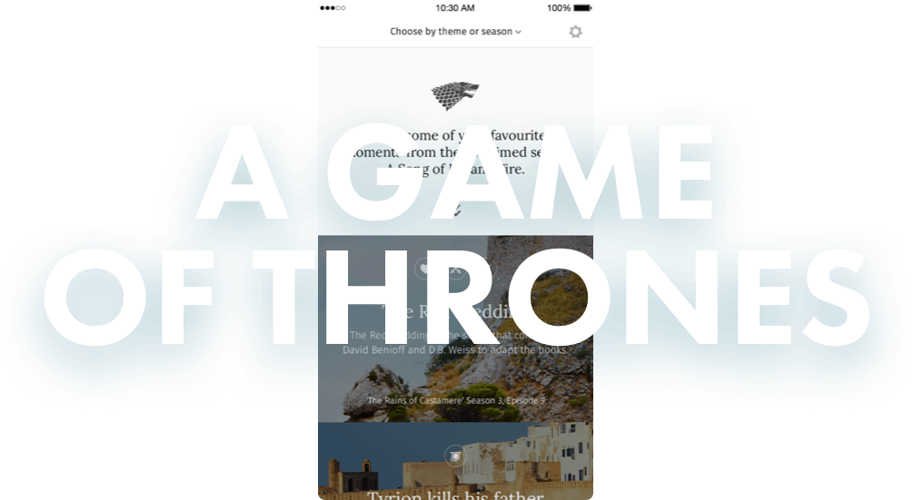
sketches
Day 3: Sketched journey based on ideation workshop
flinto
Day 6: I created a clickthrough prototype using Keynote and Flinto

Defining a moment

A moment would be a key scene from the TV show and surrounding metadata. In a snapshot you would be reminded of what happened and then be presented with a short extract of how it appeared in the books.

theme Theme
location Location
house House
characters Characters
book Book
episode Episode & Season

Finding the right visual language

The speed and level of fidelity I could achieve through early ptotoypes with Keynote and Flinto helped to test assumptions internally at Reason, with the stakeholders at HarperCollins, and potential customers through usability testing.

After buy-in from stakeholders I began to look at a visual language that best captured the series using the book covers as a starting point.

The latest edition’s book covers had moved away from mythical and illustrated, to a photographic style. This shift echoed sentiments noted during research; the fantasy aspect of the story was a turn-off for TV viewers and it would be best to steer clear from an illustrative look and feel.

I explored a muted colour palette and referred to the book covers for direction on typography, settling on Lora as the typeface most legible for headings and book extracts.

book cover comparison
The latest editions of the books used photographic covers

Expanding moments

Knowing that the core interaction on the app would be opening and closing moments, it was important to get it right. The initial idea was to have elements fade on one at a time but in the end we stripped this back to avoid overloading the device. I think the transition still works well and I’m glad we managed to emphasise the quote as it’s a glimpse of what to expect when you scroll down to the extract.

Left: Early protoyping with Sketch and Keynote. Right: Final interaction
After the app launched, I had the chance to recreate the Expanding Moment interaction with a range of alternative prototyping tools. Here’s a write up on what I found.

Making a world of ice and fire

The latest editions of A Song of Ice and Fire featured a set of photographic book covers. I wanted to use these as the background for moments as the imagery was closer to both the settings in the TV show, and the descriptions in the book.

The problem: backgrounds would become repetitive and the resolution wouldn’t be high enough for iPad Air.

The solution: use a series of stock photographs taken in the same locations as the original book covers, colour graded to match the tone.

background masks
Once a moment is selected the background unmasks and blurs to increase legibility and focus on moment metadata
stock images
I chose stock photos similar to the original location to give moments a consistent tone
final backgrounds
Final colour graded backgrounds used for moments that occur in book one, A Game of Thrones

The app icon

A well designed app icon can influence you to download an app by grabbing your attention on a wall of icons that are trying to do the same. I knew it was important to get this part right and began by exploring monochrome variations, combining the sword and crown.

app icon sketches
Exploring icon ideas on paper
app icon ideas
Using the apps accent colour as the backround and a monochrome white shape gave the strongest impact on a phone’s home screen
final app icon
The final icon: we settled on the Direwolf sigil as it was instantly recognisable from the TV show and marketing campaigns

The Final Visuals

A Game Of Thrones: Get Into The Books
Final iPad design

Colour palette

A neutral palette reflected the often dark and gloomy locations the story takes place in. This also allowed for the moment backgrounds to stand out.

colour palette

Typography

A neutral palette reflected the often dark and gloomy locations the story takes place in. This also allowed for the moment backgrounds to stand out.

typography

Iconography

iconography

House sigils

HarperCollins already had a set of monochrome illustrations that covered most sigils, I adapted these and created the remainder to cover all houses mentioned in the app.

house sigils

Moment backgrounds

I created a total of 25 backgrounds using stock photographs taken in similar locations to the book covers.

moment backgrounds

Launching The App

best new app

20k Downloads

in the first 3 weeks

Best New Apps

featured on the App Store

50% Sign Up

success rate

On 30th July 2015 the app went live, off-season, something we knew would impact downloads as the hype of Season 5 died down. Despite this, the app managed 20,000 downloads in the first 3 weeks, helped in part by being promoted under 'Best New Apps' on the App Store in over 100 countries. The app had a sign up success rate of over 50% which was well received at HarperCollins.

It's hard to determine how many downloads converted to book sales. Due to restrictions Apple places on selling physical books we could only offer in app purchses through iBooks. Even if readers preferred ebooks over physical copies, there's a good chance they'd be tied into a different ecosystem, such as Kindle.

Recognition & Mentions

Futurebook award

“It's all the incentive you'll ever need to start reading the books, and possibly get into deep conversations with excitable strangers on the subway.”

- FastCompany

Winter is coming... again

Looking back, I wish we could have tested our ideas with users straight after the finale of Season 5. Were the extracts enough of an incentive to purchase the books? Was the proposition clear enough? Would filtering by characters, and ability to share moments, have increased engagement? With at least two more seasons of the show yet to be aired there's still opportunity, and time, to learn from users and iterate on the app.

I'm proud of the work I put into creating the A Game of Thrones: Get into the Books. I learned a lot along the way, and the final product received positive feedback from both fans of the TV show, and stakeholders, including George R.R. Martin himself.